What’s New on Loxi: Design Updates, List View Options, and More
We’re happy to announce the release of some long-awaited calendar refinements to Loxi. So, let’s jump right into what’s new for you and your Loxi calendar!
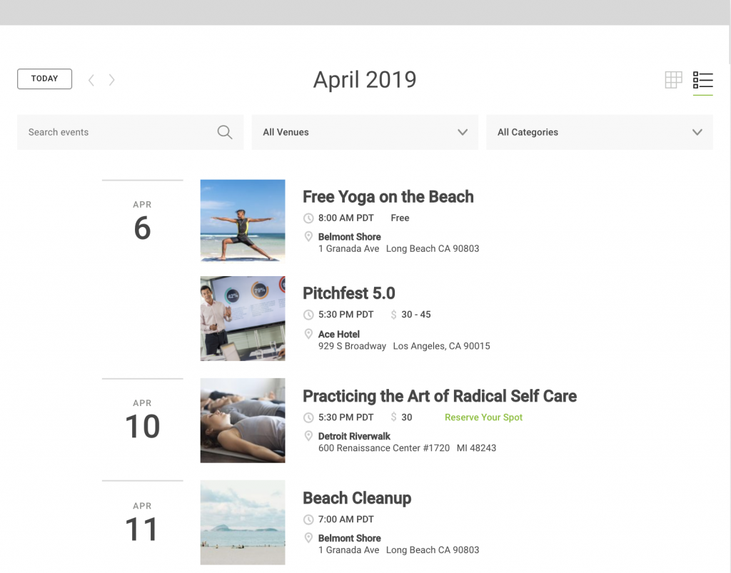
More options in List View
You’ve been loving List View for upcoming events since we introduced it late last year, now we’ve added a handy-dandy new option to toggle images on or off in list view.

This is great for calendars who aren’t heavy on imagery or just want an even faster load of the calendar. From your admin dashboard, head to settings and you’ll see this new option for your calendar.

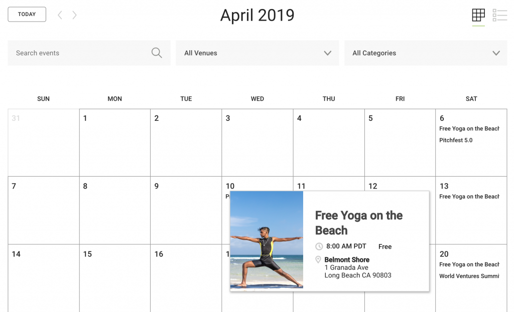
Calendar View design refresh
Our designer, Matt, has been itching to get his hands on the Loxi calendar view to do some design touchups.

You’ll notice an overall cleaner aesthetic in both desktop and mobile views. One challenge has been keeping the calendar grid square, while not abruptly cutting off event titles. We’ve solved that by shortening event titles in a more intentional style, where it’s more obvious to the calendar viewer to click the title and view more.
Bug fixes
We also cleaned up a few bugs, including:
- As an admin, when adding a recurring event, sometimes you’d end up on the confirmation screen for quite a while as it was processing. That’s fixed up and loads in the background now.
- Some users were having issues deleting events, we’ve fixed that up as well.
What’s Next?
Phew, what a couple of months—and we’re still plugging away! As always, we hope that you enjoy these new goodies and that they make managing events easier and your calendar more portable than ever.
Coming soon expect even faster calendar loading, calendar subscription options, and one of our most-requested features: RSVP.
See you next time!
Back to all posts